Deal Nucleus

Simplifying Merges & Acquisitions

Client

Deloitte UK

Info

Role

Product Designer

Timeline

3 weeks

Focus

Fintech SaaS
B2B

Enterprise

Compliance-heavy

Tools

Figma

Miro

Team

Product Owner
Project Manager

Tech Lead

Developers

(Back/Front - End, QAs)

Context

The Project

Deal Nucleus is a platform designed to revolutionise the M&A sell-side process for Deloitte's Financial Transactions Department. 


It empowers Deloitte practitioners to engage with buyers more effectively by managing the sell-side process lifecycles from preparation and planning, sharing documentation and media and due diligence, leading to better deal outcomes.

"How might we transform the deal management process to create a robust and efficient Merges & Acquisition experience for consultants and buyers."

Outcome

In the first phase, we launched key features focused on user onboarding, streamlined document and media management, and improved collaboration—boosting the business by over 50% in just three months.

Part One:

Design Sprint

Each feature was developed in a 3 week Sprint, from conception to delivery.

The successful delivery of essential features for a soft launch is a significant achievement for our project. Despite the challenges posed by tight deadlines and the pressure to deliver the MVP, we overcame them, including the initial resistance from the Product Owner towards a user-centric approach.


To overcome this, we engaged in collaborative sessions to emphasise the importance of user experience processes and foster a shared understanding of user needs and pain points and how to align with business needs.

01

Week: 1 - 3

In the first weeks, I led a user interview to quickly learn what users were experiencing. By interviewing 8 participants, I could define the main pain points so the team could prioritise the development. I also designed the first few screens and outlined the visual style, information architecture, and user flows.

02

Week: 4 - 6

Continuing on prototyping, I designed the overall basic designs for each feature and ran workshop sessions with the team to check on technical feasibility. We collaborated on changes as needed before testing with users.

03

Week: 7 - 8

Once the overall basic designs were set, I ran 5 usability testing sessions to test if the features were usable and valuable. Any insights and feedback on them should be considered and, if needed, changed before development and delivery.

User Research

I conducted a small context inquiry and user interview study with 12 people between junior and senior Merges & Acquisition consultants.

A challenge here was accessing buyers to understand their needs and goals. So, we consulted the senior consultants' experiences to extract any findings related to that group.

80%

of consultants find the process of document management time-consuming and tiresome.

A structured, well-documented colour system that integrates seamlessly with design systems and front-end frameworks.`

70%

of consultants experienced issues in communication, leading to longer deal processes.

Providing real-time tools for communication between Deloitte and buyers can decrease the gaps in communication and potential misunderstandings.

80%

of consultants expressed concern about the security and privacy of sensitive documents.

Ensuring proper access controls for different buyers to mitigate security risks.

Part Two:

Information Archictecure

Proposed flow

Part Three:

Feature #1

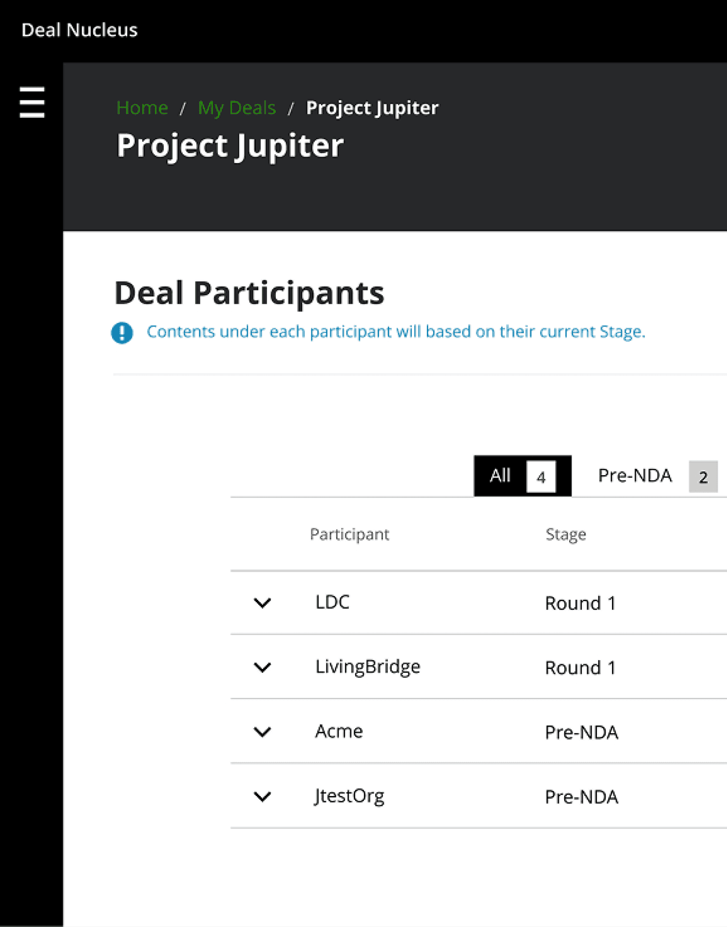
Upload Documents and Media

Simplifies document sharing for specific phases and participants.

Document sharing required precise timing based on each participant's stage in the process. Managing this from uploading to sharing was complex and risky due to the sensitive nature of most documents.

To address this, we introduced the ability to manage content through multiple stages of the process for each participant with a few clicks.

Card Component

Component Iteration

Given the variety of documents and media, the card needed to be concise and able to display a lot of information in a limited space.


Furthermore, the need for a Design System component library that met the product's needs posed a significant challenge. To address this, I investigated the cluster of different types of entries, making items easily distinguishable and organized in compact groups.


This approach enabled me to experiment with various layouts, helping me learn how to present the information meaningfully.

Feature #2

Graph colours

Testing the colour system across various visual impairments, such as protanopia, deuteranopia, and tritanopia, revealed key insights on contrast effectiveness, ensuring the palette remained distinguishable and accessible to users with colour vision deficiencies.


Upon testing the initial set of graph colours, I realised that the bright colours had the same hue, and to avoid confusion and possibly confuse users, those colours were removed from the colour palette.

Feature #3

In-App chat

Another challenging task was keeping track of every consultant's conversation, often leading to gaps and misunderstandings.

To address this, we enabled practitioners to communicate by adding notes related to each participant, ensuring more accessible provenance and security of shared information.

This feature allows users to facilitate immediate responses and seamless conversations.

Key Learnings

01

Soft launching and Data Analysis

Deal Nucleus successfully streamlined Deloitte's M&A sell-side process, delivering significant benefits such as increased practitioner engagement, a 90% improvement in document management, collaboration, and transparency, and an 85% decrease in mishandling events related to privacy and security.

02

Advocating user-centric approach

Maintaining effective communication with the Product Owner was crucial to ensuring a user-centric approach, even under tight deadlines and despite resistance from some stakeholders. This collaboration helped prioritise user needs and deliver a successful product.

03

Value of User Research

We emphasised the value of user research and testing in shaping a successful project, ensuring that user insights and feedback guided our design decisions. This approach validated our assumptions and identified areas for improvement, leading to a product that genuinely meets user needs and expectations.

You may also like

Work with me

Want to make your dream project come true?

Send me a project inquiry

Or send me an email

Recommendations

“Dedicated and detail-oriented designer with a strong growth mindset, always striving to improve and enhance user experiences”

Ivana D.

Senior Product Designer at Deloitte UK

“Highly creative, hard-working designer with strong project management and communication skills. He excels at meeting deadlines, presenting ideas, and solving design challenges”

Katherine M.

Marketing Manager at South Bank Colleges

“Proactive and insightful designer who quickly delivers quality work. At Helsa, his clickable prototype played a key role in securing VC-backed accelerator funding”

Rob C.

Entrepreneur & Fintech Leader

Let's talk

drigofernando@gmail.com

© Rodrigo Fernando 2025

© Rodrigo Fernando 2025

© Rodrigo Fernando 2025

Rodrigo Fernando

Rodrigo Fernando

Rodrigo Fernando

Deal Nucleus

Simplifying Merges & Acquisitions

Client

Deloitte UK

Deal Nucleus

Simplifying Merges & Acquisitions

Client

Deloitte UK

Part One:

Design Sprint

I led the assessment of the existing colour system and collaborated with cross-departments.

These pain points highlighted a fundamental issue: our colour system was creating barriers rather than enabling efficient, accessible design and development.


The feedback demonstrated an urgent need for a more structured, semantic approach that would serve both design creativity and development efficiency while prioritising accessibility from the ground up.

01

Week: 1

I initiated the project by analysing the current guidelines to evaluate their accessibility and the roles that we currently assign.


Also, I interviewed about 10 designers and 5 developers about the implementation and criteria for the colour choice, how the colour palette was being implemented, and any pain points they encountered regarding keeping consistency.

02

Week: 2

After collecting the findings from the user interview and identifying the main opportunities, my second task was to collaborate with Deloitte’s Branding team on how to adapt the current colour palette for web use.


The existing colour palette was first thought for a printing perspective and lacked the flexibility for web applications.

03

Week: 3

Once the overall basic designs were set, I ran 5 usability testing sessions to test if the features were usable and useful. Any insights and feedback on them considered and if needed changed before development and delivery.

User Research

I conducted task analysis research to understand the different tasks and steps Developers performed in the current platform. I also asked questions related to their goals and how they used the information within the platform.

100%

of Developers thought that the management of the new and existing enrolments were convoluted.

Streamlining the process of managing Projects and Providers would simplify the task and allow for more efficiency when checking their APIs' health and making necessary changes.

100%

of Developers expressed concern about not having ways to look into a project’s log or send requests to providers for testing environments.

Ensure developers can access features that facilitate their work when testing and solving environments' issues.

80%

of Developers mentioned that the layout was confusing, not responsive across both web and app platforms.

Provide a clear information architecture and assume that a responsible platform would allow for an accessible platform.

From idea to impact

What are we building?

Send me a project inquiry

Or send me an email

From idea to impact

What are we building?

Send me a project inquiry

Or send me an email