Info
Role
Product Designer
Timeline
6 weeks
Focus
Fintech SaaS
B2B
Compliance-heavy
System Redesign
Tools
Figma
Miro
Team
Product Owner
Project Manager
Tech Lead
Developers
(Back/Front - End, QAs)
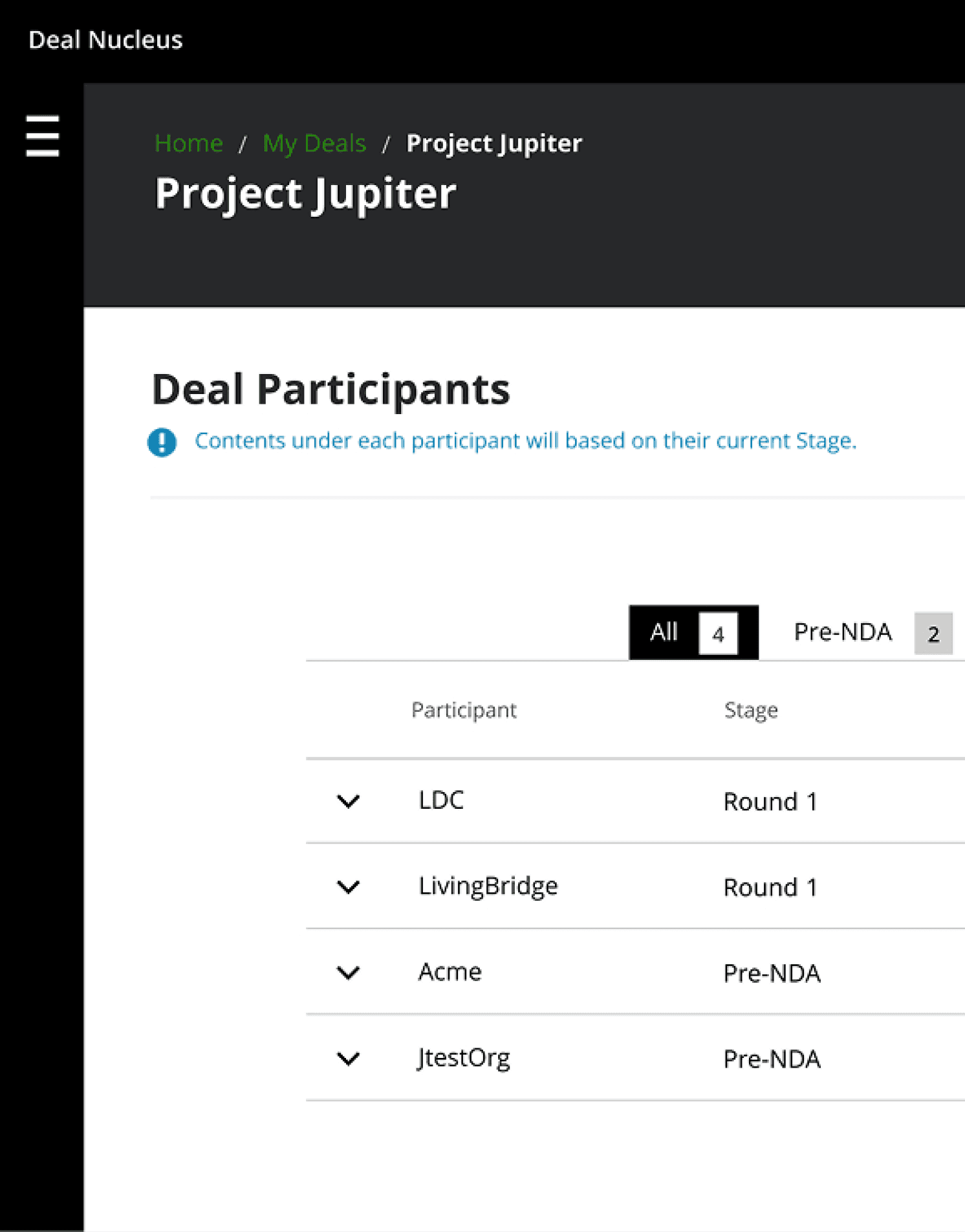
Context
The Project
A B2B case management platform used by financial institutions to investigate and manage regulatory compliance cases, including Anti-Money Laundering (AML) and Know Your Customer (KYC) workflows.
"How might we improve the form builder to reduce configuration time and make previewing and editing forms easier before publishing?"
Outcome
In the first phase, we launched key features focused on user onboarding, streamlined document and media management, and improved collaboration—boosting the business by over 50% in just three months.
Part Two:
Previous UI Screenshots
Previous User Flow

Participatory Design

Part Three:
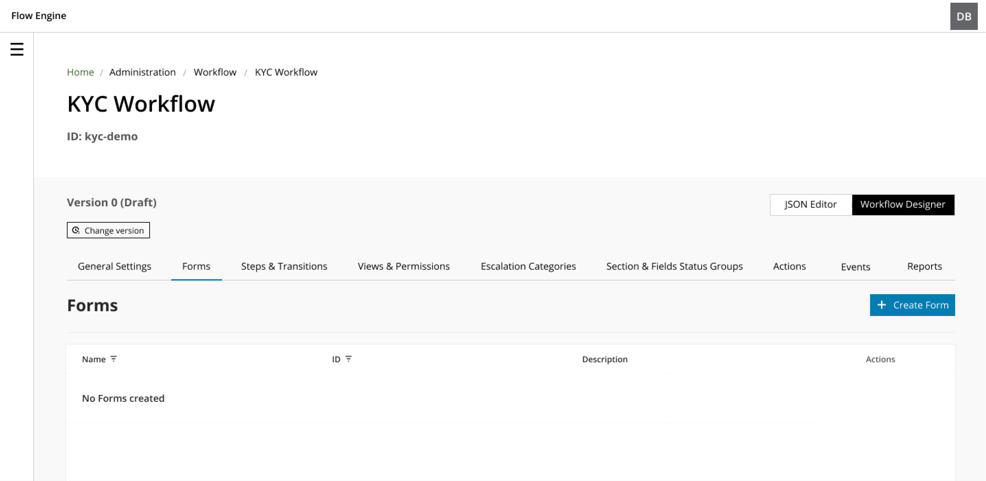
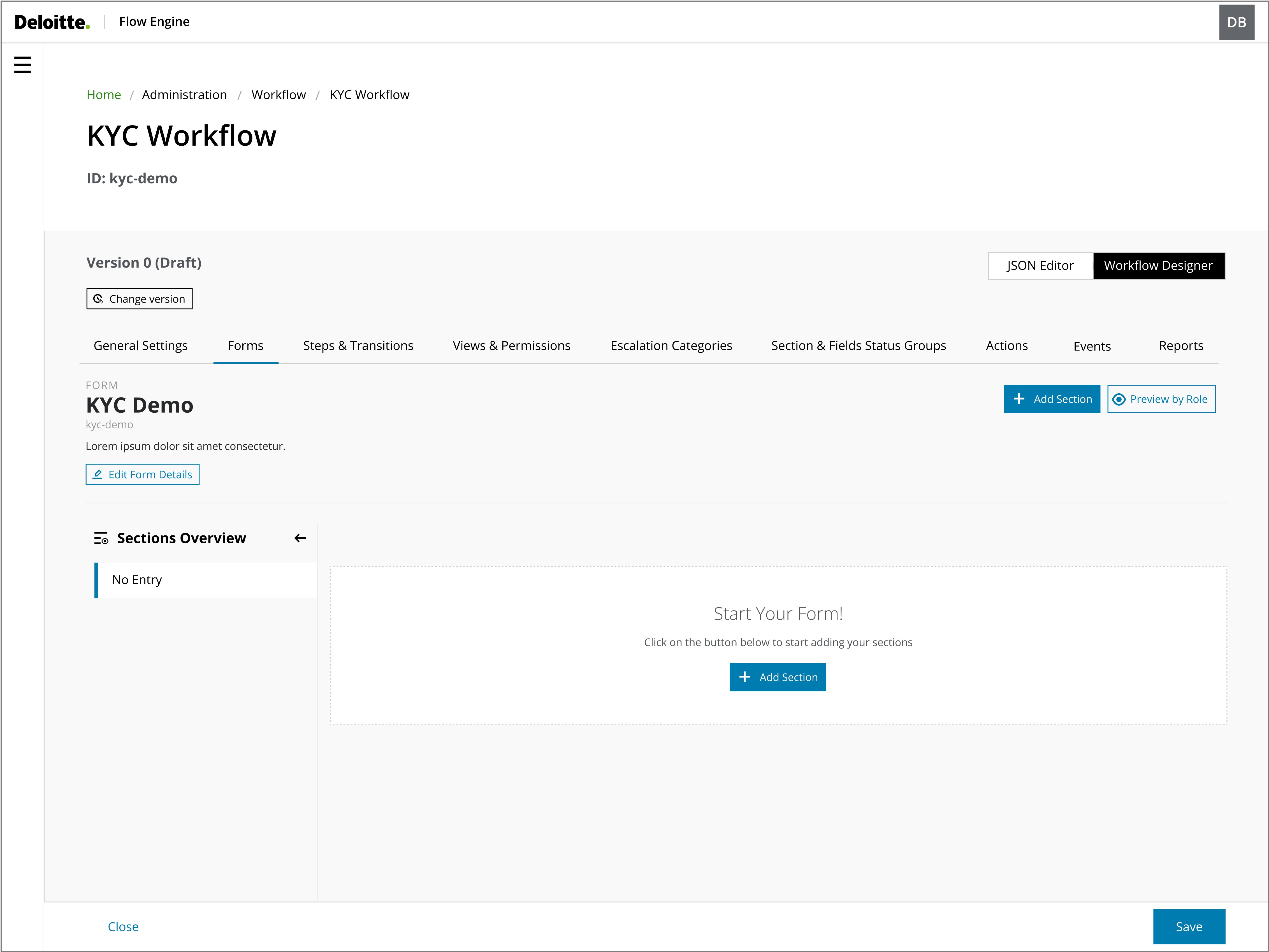
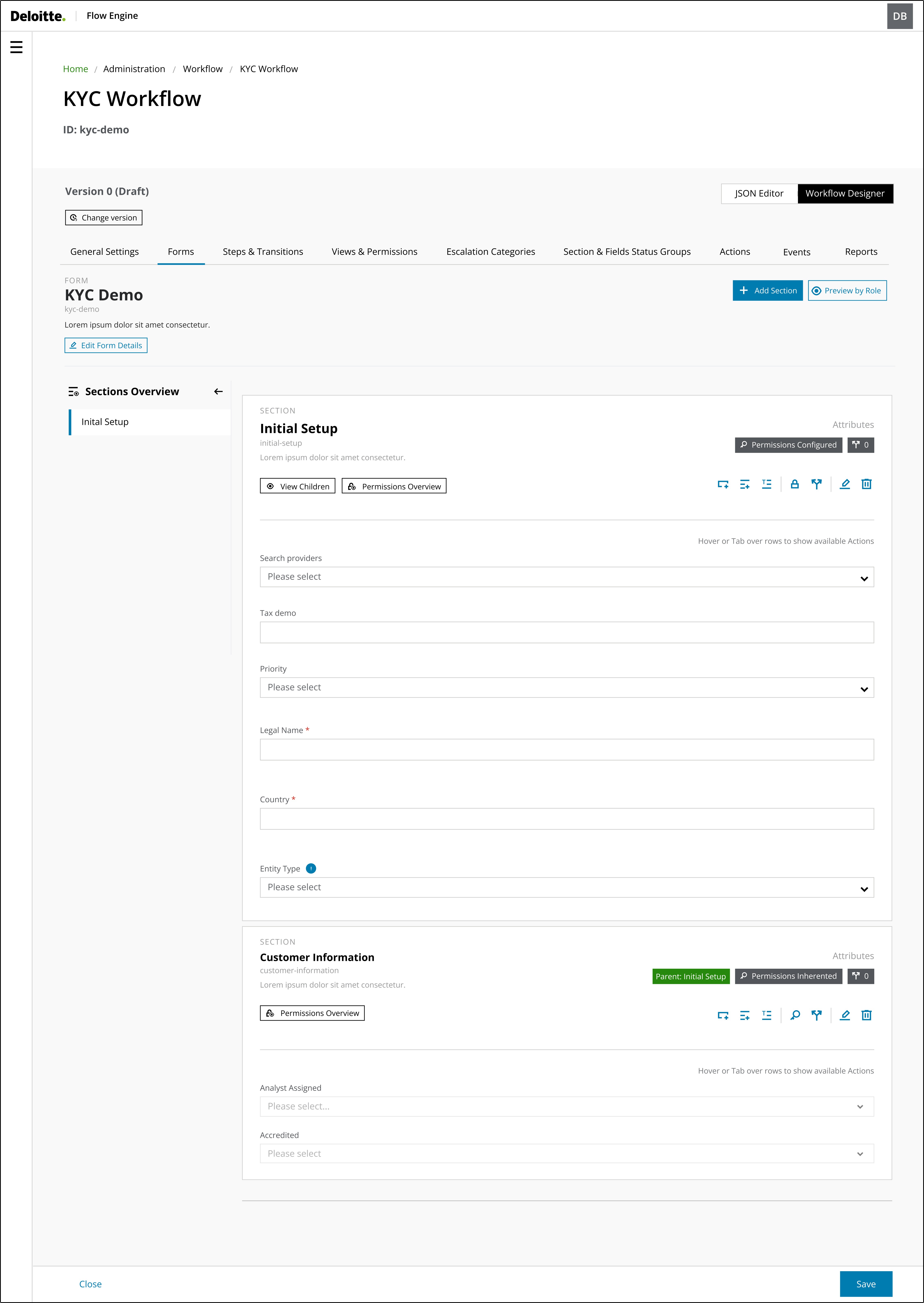
Feature #1
Form builder
The Form builder workflow was designed to be an intuitive interface.
This interface makes it easy for users to add sections and understand and navigate through the form sections, reducing confusion and errors and ultimately improving the user-friendliness and efficiency of the design.
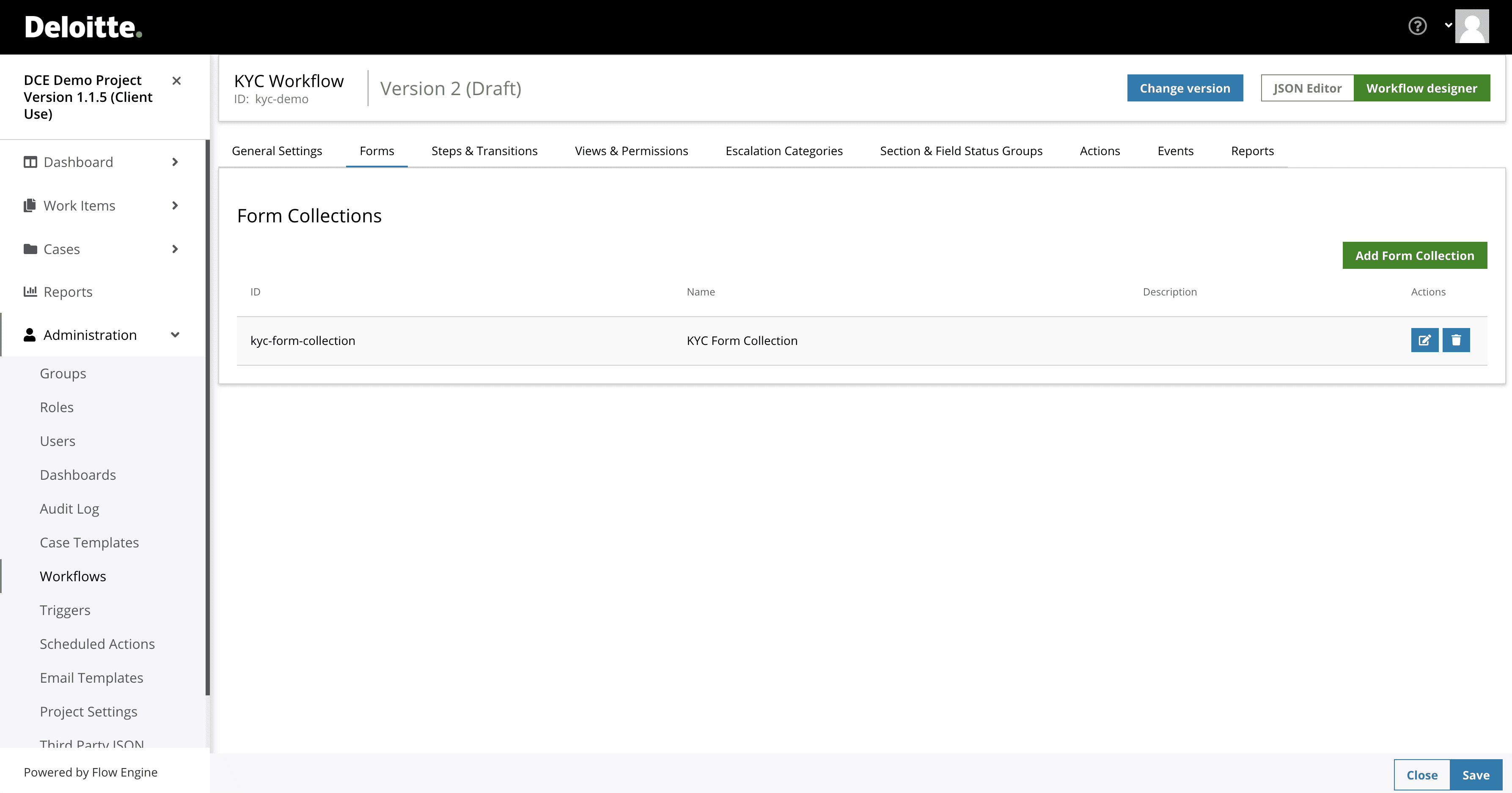
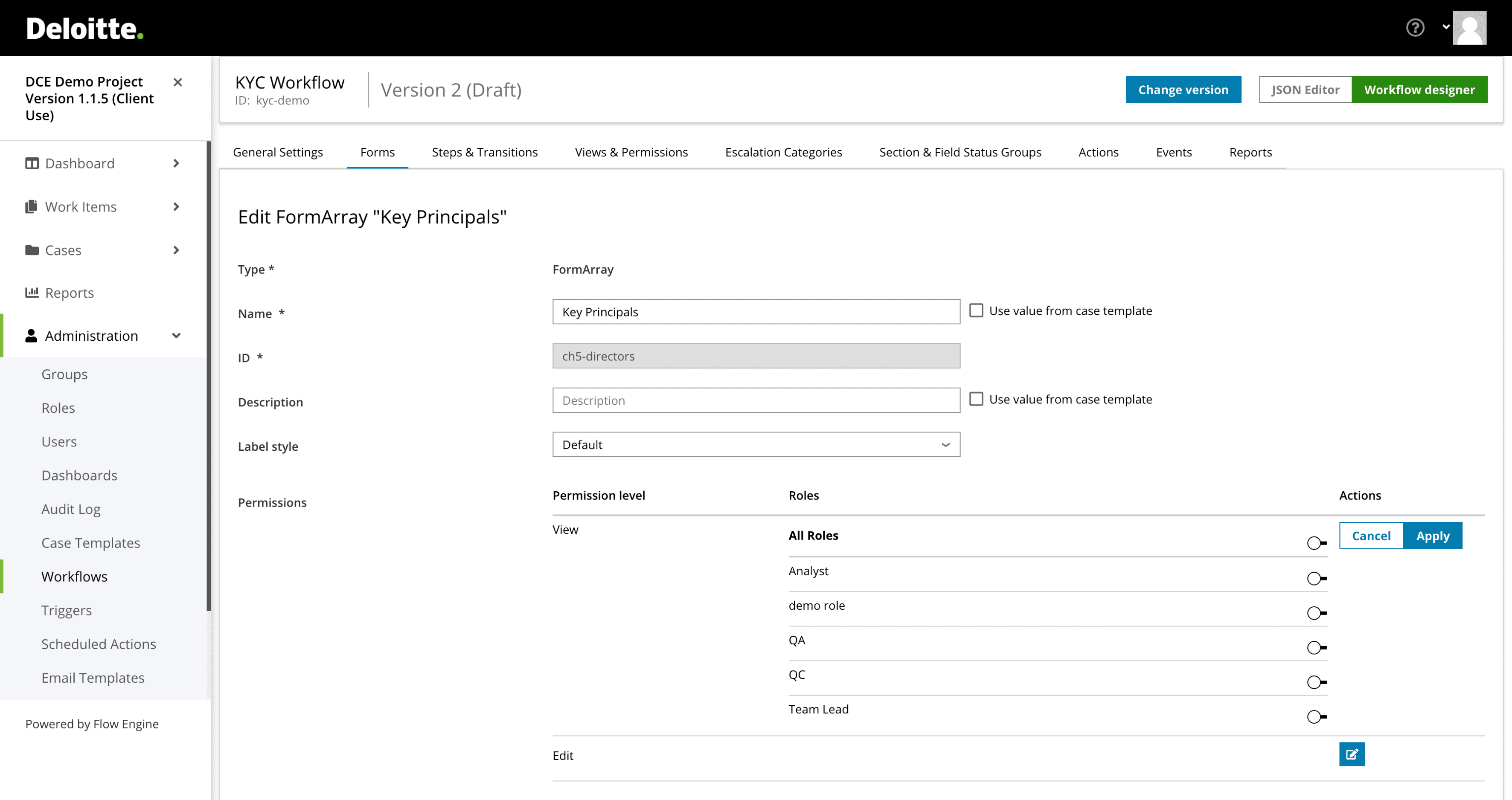
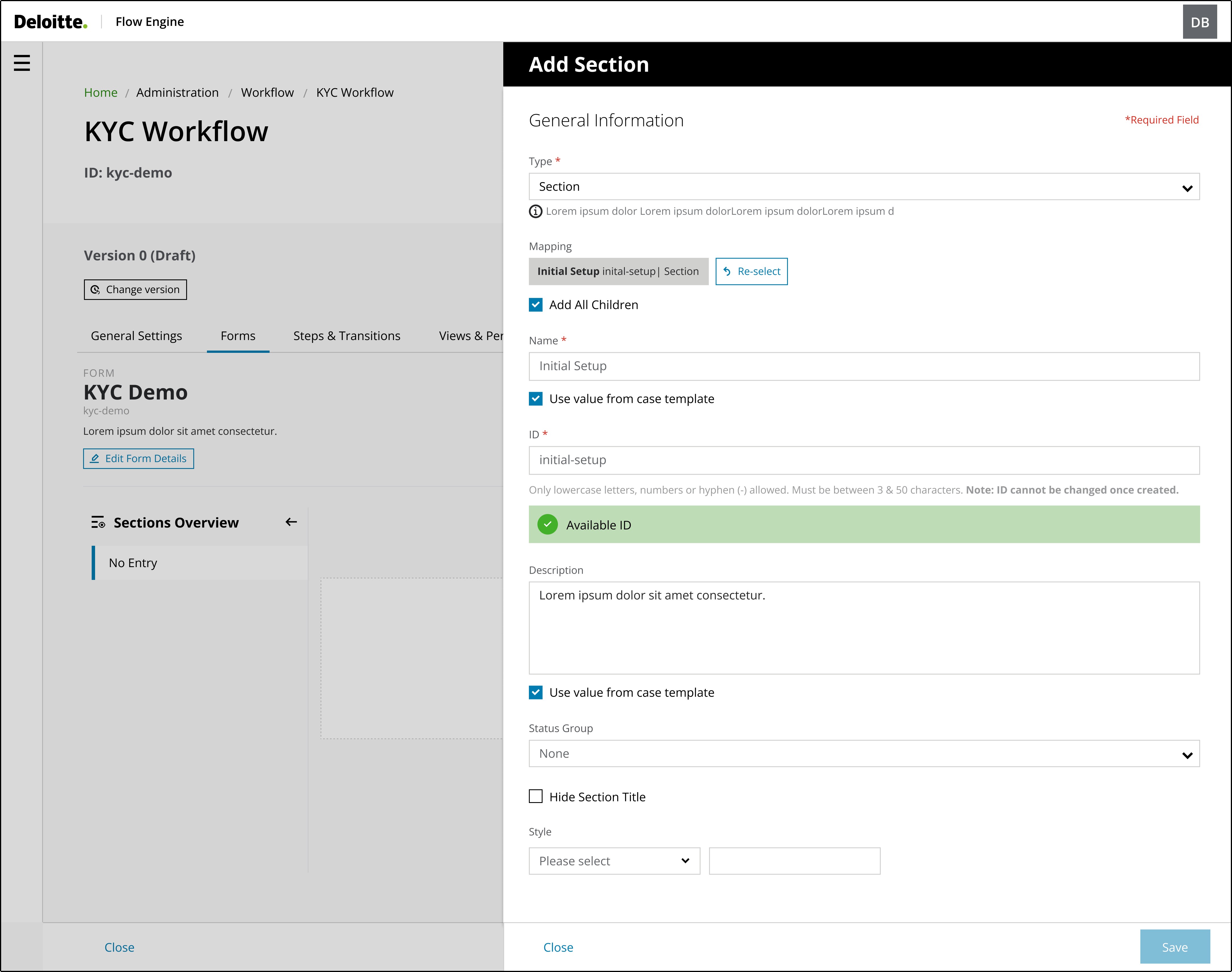
Feature #2
Add sections
Testing the colour system across various visual impairments, such as protanopia, deuteranopia, and tritanopia, revealed key insights on contrast effectiveness, ensuring the palette remained distinguishable and accessible to users with colour vision deficiencies.
Upon testing the initial set of graph colours, I realised that the bright colours had the same hue, and to avoid confusion and possibly confuse users, those colours were removed from the colour palette.
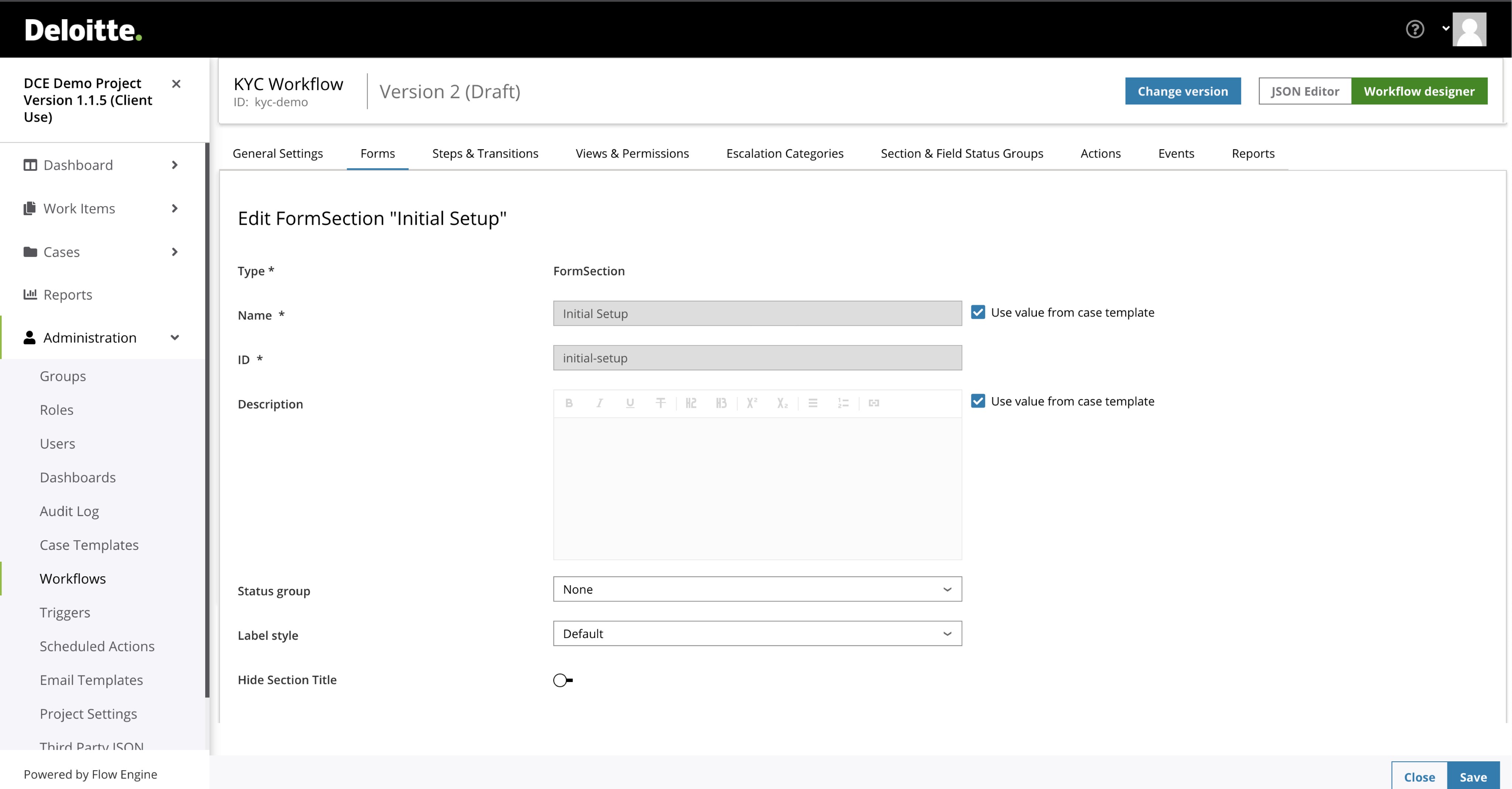
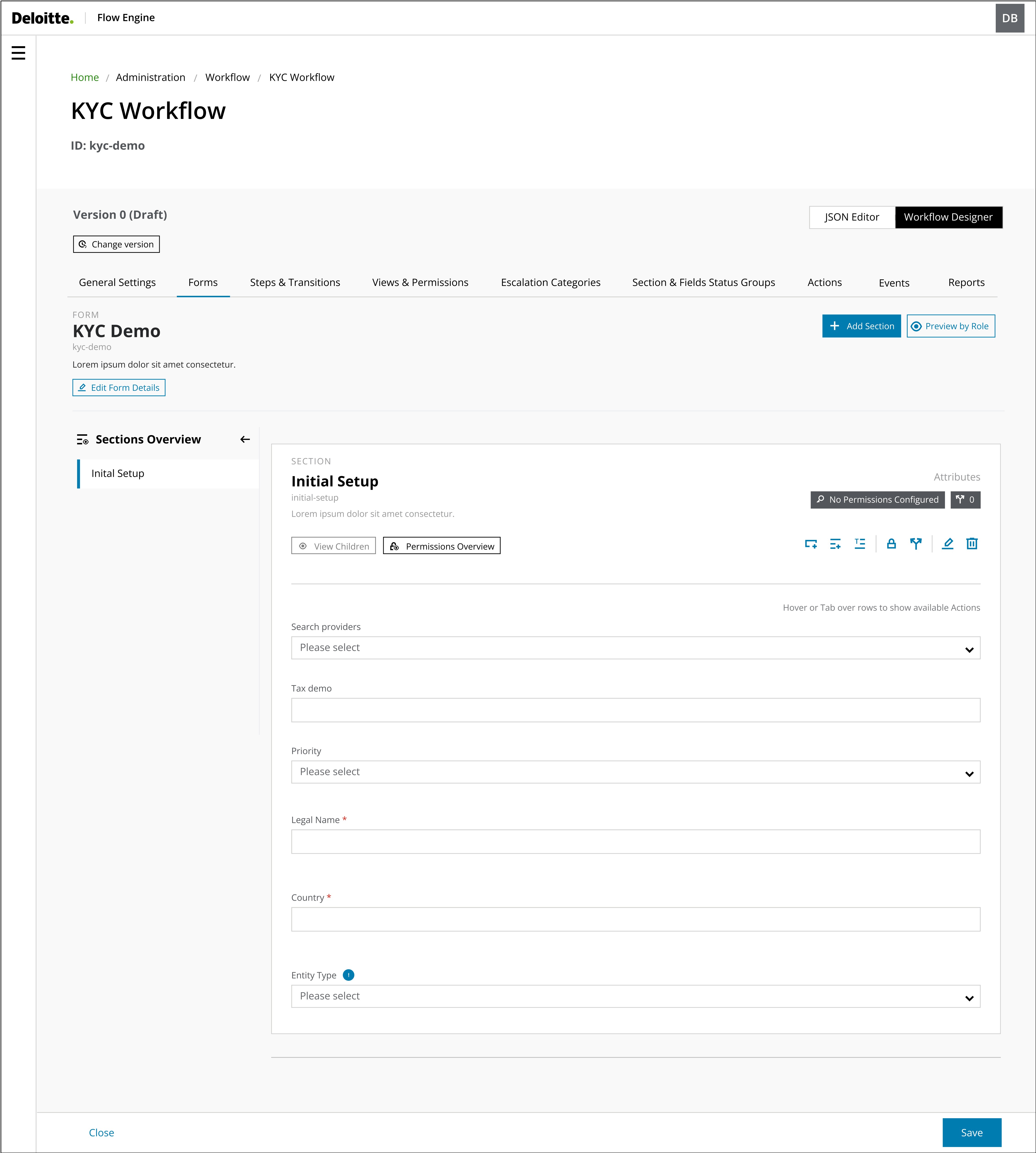
Feature #3
Form visualisation
Previously, System Administrators spent significant time switching between screens to visualise how the form appeared to the end-user.
Implementing a real-time form visualisation feature reduced the time spent on this task and made it easier for administrators to identify and correct errors immediately. This enhancement streamlined the workflow, improving efficiency and accuracy in form configuration.
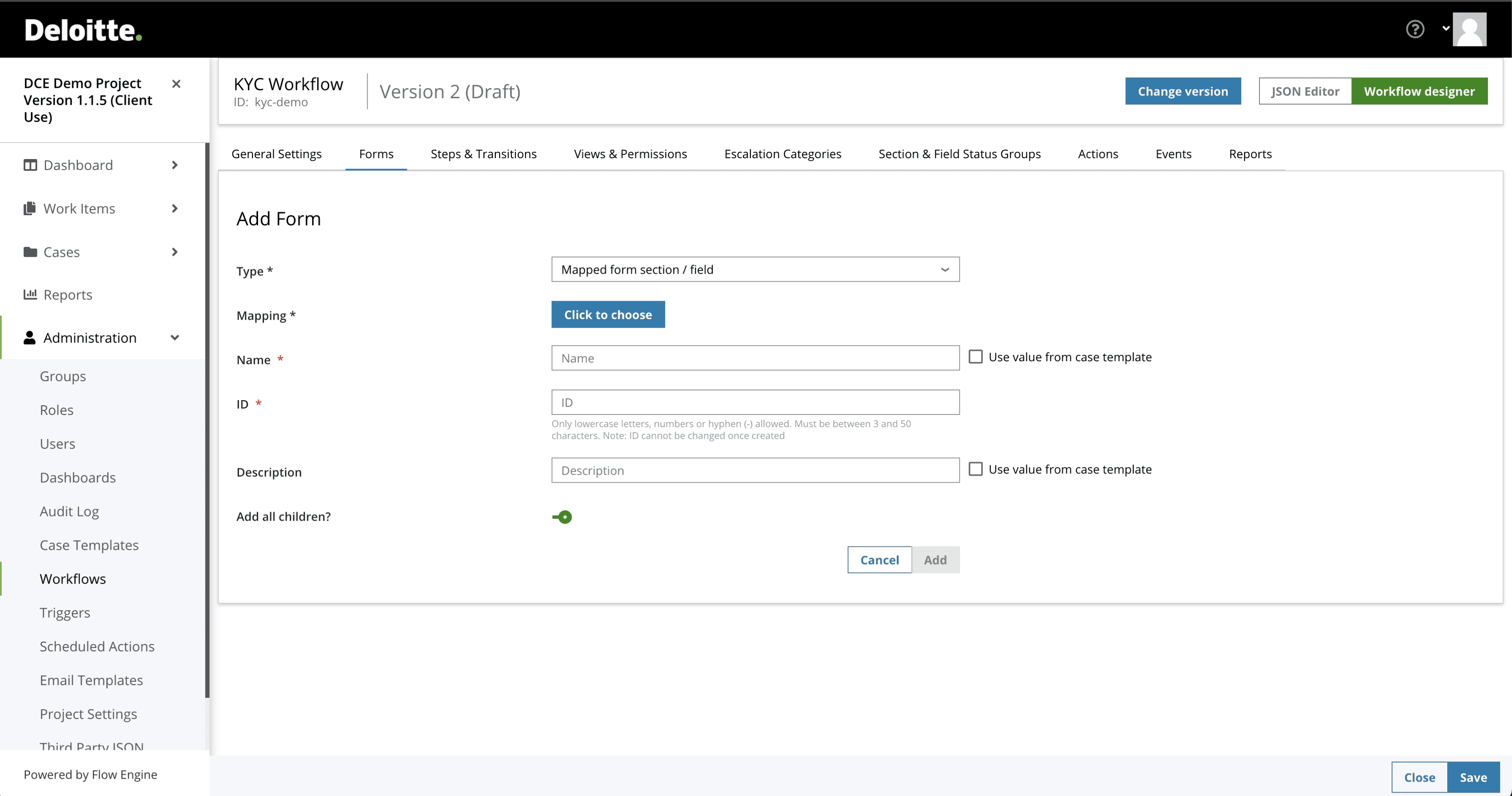
Feature #4
Parent-Children relationship
After users have added a parent section, they may need to add additional child sections or fields within that parent section.
The main goal of this interface was to provide users with a simple and easy method to add children's sections or fields while ensuring that they understand their relationships. The interface must be logical and intuitive, aligning with how users naturally structure information.
By implementing a design that mirrors users' real-life understanding of parent-child relationships, the aim was to establish a more user-friendly and efficient system. This approach significantly reduces cognitive load and enhances the overall user experience, as the system's structure aligns with users' expectations.
Key Learnings
01
Participatory Design
A key lesson was the importance of involving users and stakeholders early and often in the design process. As we shifted to two-week sprints, rapid iteration was crucial. We achieved more user-centric and practical solutions by incorporating their needs and insights. This collaborative approach also fostered a sense of ownership and alignment among all participants.
02
User Mental Models
I learned the importance of understanding and aligning with user mental models. By deeply analysing other applications and how users think and interact, we were able to design more intuitive and practical solutions. This approach ensured the product met user expectations, was technically feasible and enhanced the overall user experience.
03
Complex Workflows
When tackling complex features, it's crucial to prioritise the user journey and iterative user testing. We identified potential pain points by mapping out the different paths users might take to achieve their goals. Also, through testing, we refined the design, making the feature a more intuitive and efficient experience.
You may also like


Recommendations
“Dedicated and detail-oriented designer with a strong growth mindset, always striving to improve and enhance user experiences”
Ivana D.
Senior Product Designer at Deloitte UK
“Highly creative, hard-working designer with strong project management and communication skills. He excels at meeting deadlines, presenting ideas, and solving design challenges”
Katherine M.
Marketing Manager at South Bank Colleges
“Proactive and insightful designer who quickly delivers quality work. At Helsa, his clickable prototype played a key role in securing VC-backed accelerator funding”
Rob C.
Entrepreneur & Fintech Leader
Let's talk
drigofernando@gmail.com