Info
Role
Product Designer
Timeline
3 weeks
Focus
Developer Tool
Tools
Figma
Team
Product Owner
Project Manager
Tech Lead
Developers
(Back/Front - End, QAs)
Context
The Project
Updating the colour guidelines to support best practices and provide flexibility for various products and contexts.
"How can we revise the application of Deloitte's branding colour palette for web use while ensuring all platforms remain consistent with the brand's visual language?
Outcome
The update decreased implementation time by 70%.
It ensured scalable products across all departments and reduced design decisions by all the company's designers, enhancing colour usage, flexibility, and consistency.
Part Two:
User Flow

Participatory Design


Part Three:
Feature #1
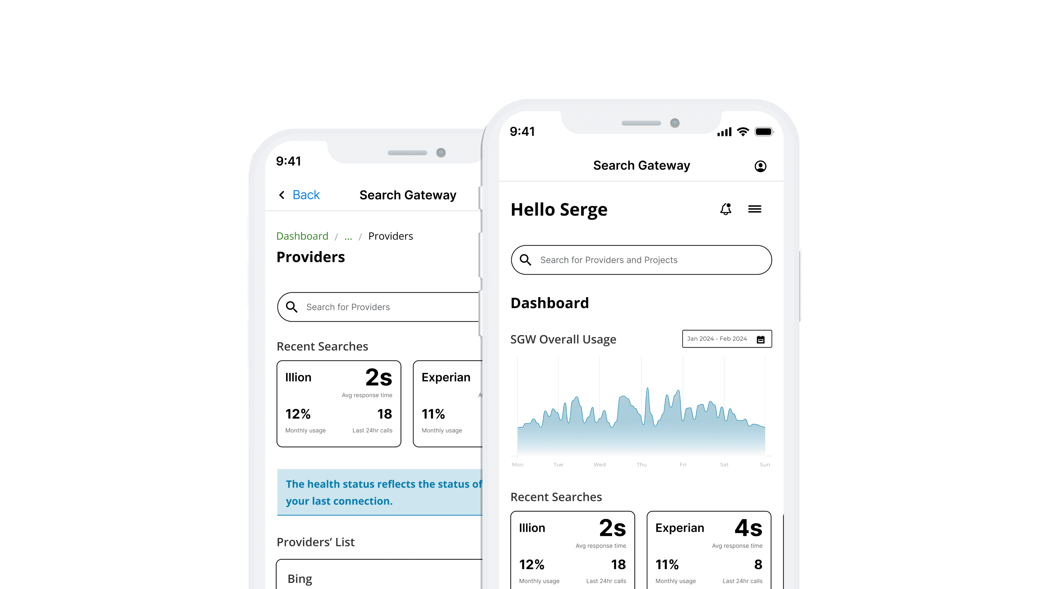
Dashboard
This design addresses developers' concerns about the Search Gateway platform and enhances overall usability, ensuring a more intuitive and practical user experience.
The Dashboard offers comprehensive real-time updates and clear overview information of the systems, allowing developers to see system status insights. It includes a streamlined search function for quickly locating existing environments.
Feature #2
Portfolio page
the Portfolio page delivers an at-a-glance view of providers and projects, facilitating quick access to frequently used enrolments, which supports the heuristic of recognition rather than recall by minimising the cognitive load required to retrieve this information.

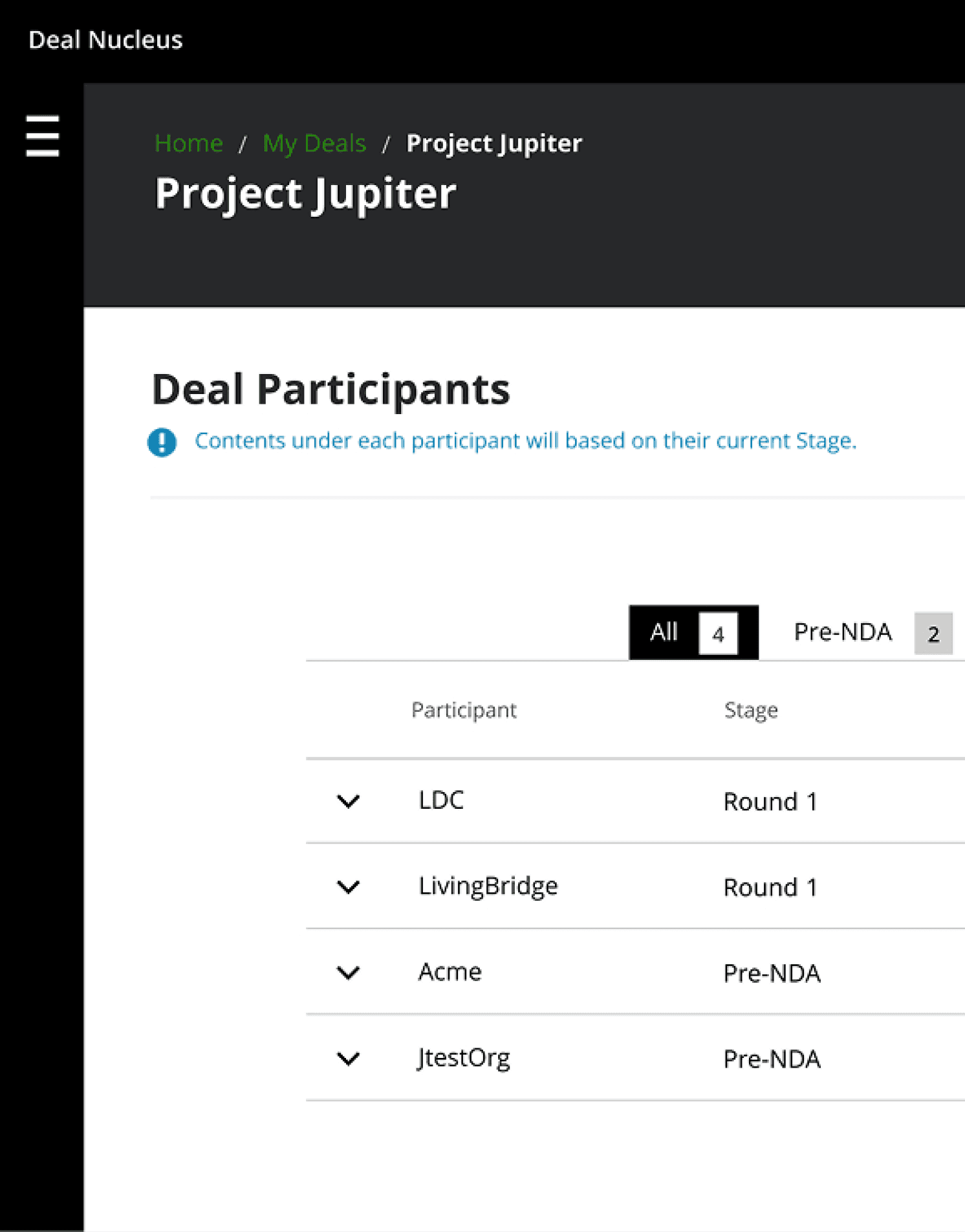
Feature #3
Provider's Management page
The Provider's page aimed to deliver detailed information about each environment, including its usage statistics, integrated projects, and error information. It ensures users have immediate access to crucial data and the flexibility to adjust efficiently.
This page also enables direct editing within the Swagger interface, streamlining the process for developers.
Key Learnings
01
Rapid prototyping and testing
The developers received the new platform well. They thought having a web and app version was helpful, although they mentioned that we should rethink what features each version would include.
Also, the new user journey felt more intuitive, and less time was spent searching for issues and understanding their causes
02
Project Prioritisation
This project was an initiative outside the scope of the team's backlog, so from the start, we assumed it could be put on hold at any moment. We struggled to manage the time of some of the team's main stakeholders, and the project was red-flagged, which could lead to bottlenecks and delayed milestones
I had to act quickly to deliver a solution to showcase the potential impact and benefit of the improved experience and interface to the developer's work. This approach allowed me to navigate the complexities of the project first to achieve optimal outcomes by focusing on high-impact tasks first
03
Value of User Research
I initially aimed to maintain feature parity across both platforms, assuming this would ensure a consistent user experience. However, through user testing and feedback, it became evident that users preferred quick, on-the-go interactions such as checking API health status or lines of code on the mobile version while maintaining the comprehensive functionality and more detailed information on the web platform
Tailoring features to the strengths and context of each platform would improve user satisfaction and engagement and address the distinct behaviours and preferences across platforms
You may also like


Recommendations
“Dedicated and detail-oriented designer with a strong growth mindset, always striving to improve and enhance user experiences”
Ivana D.
Senior Product Designer at Deloitte UK
“Highly creative, hard-working designer with strong project management and communication skills. He excels at meeting deadlines, presenting ideas, and solving design challenges”
Katherine M.
Marketing Manager at South Bank Colleges
“Proactive and insightful designer who quickly delivers quality work. At Helsa, his clickable prototype played a key role in securing VC-backed accelerator funding”
Rob C.
Entrepreneur & Fintech Leader
Let's talk
drigofernando@gmail.com